Accelerate deals and increase win rates with the leading enterprise demo platform.
The Ultimate Guide to Product Tours in 2025

April 3, 2025
Table of Contents
Modern enterprise software buyers have a lot of choices. Instead of long, drawn-out RFPs, buyers want to see products firsthand. Forrester research shows that 60% of buyers will go to a vendor’s website before accepting an online or in-person sales meeting.
As a result, the ability to effectively showcase the value and features of your offering to users is critical. Product tours, or product demos, have emerged as a powerful tool to engage, educate, and convert prospective users. This comprehensive guide will dive into detail on product tours, exploring what they are, why they matter, and how to create them successfully. We will also discuss the tools and software that can streamline the process, as well as showcase some of the best product tours.
What is a Product Tour?
A product tour is an interactive, guided walkthrough that introduces users to the key features, functionalities, and benefits of a digital product or service. Think of it as a virtual guide taking users on a journey through your product, highlighting its value and guiding them to their desired outcomes.
The Importance of Product Tours
Product tours are not just a nice-to-have in your product marketing strategy, they are a strategic tool that plays a pivotal role in bridging the gap between your offering and your users. In fact, product tours can be more effective than traditional PLG tactics such as SaaS free trials. Understanding the significance of product tours is crucial for businesses looking to engage, educate, and convert users effectively.
1. Faster Sales Cycles and Higher Conversion Rates
The moment a user visits your website, their level of engagement can determine whether they stay, explore your product, and eventually speak with sales or convert into customers. This is a use case where product tours shine. Product tours capture users’ attention right from the start, allowing them to experience the product for themselves before committing to a sales conversation. After speaking with sales, your champions can use product tours as a tool to convert other committee decision-makers.
By engaging prospective buyers and potential customers, assisting them in onboarding, and ensuring they discover the product’s key features, tours can significantly boost conversion rates. Users who understand a product thoroughly are more likely to take the desired key actions, whether it’s making a purchase or adopting a higher product tier than they have today.
2. Onboarding Assistance
The onboarding process can be a make-or-break moment for many users. If it’s overly complex or confusing, users may abandon your product before experiencing its true value. Product tours act as expert guides during this critical phase, ensuring that users get started quickly and smoothly. They serve as a roadmap, increasing customer satisfaction and reducing any initial hesitation users may have.
3. Feature Adoption & Discovery
Many complex products offer a wide variety of features and capabilities. However, users may not be aware of all these features, or how to use them effectively. This is where interactive guides like product tours are effective educators. They systematically introduce users to each feature, explaining its value and providing hands-on experience. This ensures that users don’t miss out on any of the product’s capabilities.
In summary, product tours are a strategic tool that can significantly impact conversion rates, customer engagement, onboarding success, and feature utilization. When designed thoughtfully and executed effectively, product tours become the cornerstone of a user-centric approach, fostering positive user experiences and long-lasting relationships with your product or service.
Essential Elements of a Successful Product Tour
Creating effective product tours involves integrating several critical elements that collectively enhance user experience and maximize the tour’s effectiveness. These elements ensure that users not only engage with the tour but also gain a deep understanding of your product or service.
User-Friendly Design
At the core of a successful product tour is a user-friendly design. A well-thought-out design serves as the foundation upon which the entire tour is built. It encompasses both the visual aesthetics and the navigational aspects of the tour. Ideally, your product tour will look and feel like your real product, and show off your product in the best possible light.
- Visual Aesthetics: A visually appealing design captivates users from the moment they start the tour. It should align with your brand identity, while putting the product’s most prominent features front and center.
- Navigation: Navigational ease is equally crucial. Users should be able to effortlessly move through the tour. This reduces friction and ensures that users remain focused on the tour’s content.
Interactive Presentation
Interactivity is a hallmark of an effective product tour. Interactive product tours and product walkthroughs transform a passive viewing experience into an engaging journey where users can visualize themselves using your product and immerse themselves in the content.
- Engagement: Interactive elements, such as tooltips, quizzes, and surveys, grab users’ attention and maintain their interest throughout the tour. That way, users are not passive observers, but active participants in the product tour experience.
- Effective Recall: People tend to remember information better when they actively engage with it. Interactive elements make it more likely that users will retain the knowledge shared during the tour and ultimately become more qualified prospects.
- User Feedback: Interactive tours provide valuable opportunities for collecting user feedback. Users don’t always have to participate in solicited feedback such as surveys. Interactive demo platforms provide user analytics that detail areas of engagement, so you can pinpoint which areas of your product tour generate the most engagement.
Clear, Concise Information
The effective communication of information is key during a product tour. Clarity and conciseness are essential to ensure that users grasp the key messages without feeling overwhelmed.
- Effective Communication: Clear and concise information ensures that users not only receive the message but also understand it. Try to avoid complex jargon and lengthy explanations in favor of straightforward language.
- Time Efficiency: Today’s users appreciate efficiency. Keeping descriptions brief allows users to quickly digest essential details without spending excessive time on the tour.
- Reduced Cognitive Load: Cognitive load refers to the mental effort required to process information. A well-structured tour with clear and concise information minimizes cognitive load, making it easier for users to absorb and retain knowledge.
Achieving the right balance between brevity and completeness can be challenging, but it is crucial. While it’s essential to provide sufficient information, it’s equally vital not to overwhelm users with unnecessary details. That’s why any successful product tour is built upon these essential elements: a user-friendly design that captivates users visually and simplifies navigation, interactive elements that engage users and facilitate effective learning, and clear, concise information that ensures effective communication.
Mastering these elements can significantly enhance the impact of your product tour, resulting in more engaged users and higher rates of conversion. Keep in mind that choosing an interactive demo platform with analytics will help you understand exactly how your buyers are engaging with your product tour, so you can refine your tour to optimize conversions.
Step-by-Step Guide to Creating Product Tours
Now let’s answer the question: How do you create a product tour? Let’s navigate through this journey step by step.
Step 1: Define the Flow of the Product Tour
Defining the flow of your product tour is where the journey begins. It’s the foundational step that shapes the entire tour experience. However, it’s not without its challenges and potential setbacks. Here are a few things to consider in this process.
- Clarity of Purpose: Defining the flow is essential to ensure that your tour aligns with your objectives. Without a clear purpose, your tour may wander aimlessly, leaving users confused and disengaged. A lack of a well-defined purpose can result in a disjointed and confusing tour that fails to meet user expectations. For example, if the objective is site conversions, you want to think about where to put your CTA. If it’s new feature awareness, it’s important to hide all other features that might serve as a distraction.
- User-Centric Approach: Structuring the tour based on user needs and goals is recommended, but a one-size-fits all tour may not be the right approach for your company. Users are diverse, and their pain points or use cases may vary dramatically. Incorrect assumptions about user segment preferences can lead to a tour that doesn’t resonate with the target audience, so it’s worth investing in a tool that can streamline the process of creating more personalized tours targeted at a variety of personas.
- Efficient Development: A well-defined flow can streamline the development process if you aren’t using an interactive demo platform. Even so, when requirements change, adapting the tour can be time-consuming. Keep in mind that frequent changes in requirements can disrupt the development timeline, potentially delaying the tour’s launch. Working with a low-code or no-code tool can help product marketers and other stakeholders like sales AEs build interactive product tours themselves, minimizing involvement from developers or SEs.
Step 2: Design Each Step of the Product Tour
Designing each step of the product walkthrough involves creating the visuals, interactive elements, and content that will guide users. When crafting your product tour, keep the following things in mind:
- Visual Appeal: Effective design captivates users and leaves a lasting impression. However, creating a visually appealing product tour can be resource-intensive, requiring skilled designers and creative effort. Using a dedicated interactive demo creation tool can make your product tour look and feel exactly like your product, taking the lift off of designers and creatives on your team.
- Alignment with Brand: Consistent design reinforces your brand identity, but achieving this alignment can be challenging. Maintaining a harmonious visual theme throughout the tour while accommodating various design elements can be complex. Keep in mind that consistent branding strengthens brand recognition and trust.
- User Engagement: Thoughtful design can keep users engaged throughout the tour, but it also raises concerns about implementation. Making design changes after implementation can be a complex and time-consuming process if you aren’t using an interactive demo tool. An inflexible design can result in a static tour that fails to adapt to changing user needs or feedback.
Step 3: Implement User Feedback
User feedback is invaluable for refining your product tour over time. With the right user analytics, this process becomes much simpler.
- Continuous Improvement: Embracing user feedback is essential for tour enhancement over time. However, the process of collecting, analyzing, and implementing feedback can be resource-intensive, requiring dedicated efforts. It doesn’t have to be that way. Choose a solution that provides product tour advanced analytics, so you can understand exactly which aspects of your demo resonate with your users.
- User-Centric Approach: Implementing user suggestions demonstrates that you value their input, but it can be challenging to strike the right balance. Differing opinions among users can lead to conflicting feedback. When in doubt, it may be easiest to tailor multiple, custom demos if feedback differs dramatically.
- Bug Detection: Users can be valuable bug detectors, but addressing technical issues highlighted by active users can be resource and time-consuming. It’s possible to avoid technical demo failures by using a demo creation tool that’s divorced from your product’s backend, so that if anything goes wrong with your software in production, demo users won’t see it.
Creating a Product Tour with the Best Product Tour Tool
Many marketers and product teams develop product tours without the aid of a dedicated demo creation platform. The process often involves the following steps:
- Seeking Expert Guidance: Product marketers reach out to technical experts, typically SEs or developers, for insights into the latest features or updates. Technical experts, while willing to help, often have tight schedules, leaving marketers with limited time for guidance and collaboration.
- Manual Recording: The SE creating the demo usually then enters the live product environment and manually records each step of the user experience, from login to navigation. The process can be meticulous and time-consuming, demanding substantial effort.
- Dependency on Live Product: Since the team is dependent on a live product, a lot can go wrong. Also, teams often need to wait until new features are live before creating the next demo, leading to a cyclical process of having to reinvent the wheel for each new tour.
Leveraging a Demo Creation Platform
To contrast, many teams use a dedicated demo creation platform, such as Reprise, to craft product tours. This method introduces efficiency into the process, since it’s easy to create a tour without substantial effort from developers or SEs. Here are some of the key benefits of using a demo creation platform:
- Selective Screen Capture: Teams select only the screens they wish to feature in the demo, bypassing the need for time-consuming login or homepage steps. In some cases, they can access test environments to preview features that may not be available yet.
- Focused Content: Rather than elaborating on every single feature, demo creators can focus on capturing the ‘aha moments,’ or the critical interactions that resonate with users and accelerate time-to-value.
- Efficiency and Precision: The entire process — including demo creation, data cleanup, and anonymization — can be completed in a matter of hours, without the need for coding skills. If you need to tailor more demos to a different persona, it’s easy to start with a golden demo and make edits to customize it to each user group.
- Flexibility for Updates: When new features are introduced, demo creators can effortlessly swap out a few screens, avoiding the need to recreate the entire demo.
Modern B2B buyers increasingly seek tangible experiences with products. Marketers or product teams relying on a manual approach may struggle to bridge the gap between technical functionality and user experience, limiting their ability to offer immersive demos. To contrast, leveraging demo creation software empowers marketers to create interactive, engaging, and personalized experiences without the need for coding skills. This approach frees up SEs for strategic, technical demos later in the sales cycle, where their time and talent is best spent.
Inside the Reprise Interactive Demo Creation Platform
Product demos on a company’s website are one of the first resources buyers use during their evaluation process. According to Gartner, modern buyers only spend 17% of their time meeting with suppliers, and highly value when companies provide information (like product tours) up front to navigate their purchase. Once the prospect reaches sales, demos become a critical tool in accelerating the buying cycle even further. Sales AEs and SEs leverage demos to tell detailed stories, showcasing how products meet prospects’ specific pain points.
The Reprise demo creation platform is meant to address needs throughout the GTM lifecycle, via three integrated products:
- Reprise Reveal™: easy customization of live demos by presales and sales teams for a first call
- Reprise Replay™: creation of interactive product tours and guided demos by marketing and presales teams
- Reprise Replicate™: cloning of a full application to create a reusable, interactive demo environment
The goal is to make it easy to start with Reprise, and provide the flexibility, extensibility, scale and security to expand to hundreds or thousands of enterprise users across multiple use cases.
For product tours specifically, demo creators can build their own interactive product demos quickly and easily. Walk-through guides that help tell a product’s story — without extensive technical resources. Global find and replace capabilities make it easy to edit demos and anonymize data on the fly. Finally, demo analytics and user activity insights show teams which demos are performing the best, and which features resonate most with specific users.
Best Product Tours
So, now that we know how to create one, what makes the best product tour? Let’s walk through some of the criteria that make product tours most effective:
- Clarity: Focus only on the aspects of your product that are most relevant to the target user, avoiding a “feature dump” style of demo that can easily lose users in the details.
- Engagement: Regularly review your demo analytics to understand what parts of your demo generate the most engagement with users. Refine your demos over time and focus them on what resonates best.
- Conversion: The right product tour can help you generate leads and convert them to qualified prospects for your sales team. In fact, Reprise-powered demos delivered 60% uplift in average website interactions converted to leads, and a 50% increase in average conversion from lead to pipeline.
- Reusability and Customization: With a demo creation platform like Reprise, you can reuse and customize demos to avoid reinventing the wheel. That way, you can create custom demos based on certain features, pain points, or use cases. According to the same study cited above, Reprise users experienced a 400% increase in demo capacity, without SE involvement.
Top Product Tour Examples
The Reprise platform enables teams to create interactive product tours for a variety of use cases. Here are a few examples of highly effective Reprise-powered demos.
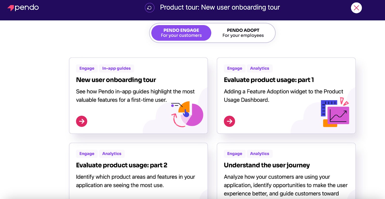
- Pendo, a product experience company, leverages interactive walkthroughs as an alternative to free trials for prospects. The company’s marketing team has spun up an extensive demo library to showcase all of its offerings. The company’s demos are the highest-performing CTA, dominating website conversions and scaling to 200,000 visitors per month.
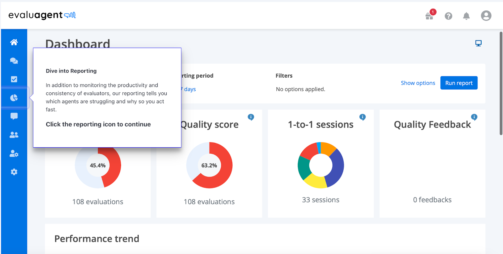
- EvaluAgent’s quality assurance platform is so robust that it almost needs to be test driven in order to grasp its full potential. As a result, the EvaluAgent team launched an entire library of custom, interactive product tours that highlight specific product features. The brand sees more than 400 monthly visits to its interactive product tours, resulting in faster sales cycles. Check out how EvaluAgent created a library of product feature demos, with popups like the one in the screenshot below.
FAQs
We hope this guide has been helpful to get you started on your journey to creating effective product tours. Let’s address some of the most common questions.
How Do I Make a Product Tour?
Creating a product tour involves defining the flow, designing each step, and implementing interactive elements. Utilizing a demo creation platform like Reprise can streamline the process.
How Effective Are Product Tours?
Well-crafted product tours can significantly enhance user engagement and conversion rates, delivering more qualified leads to your sales team. As noted above, Reprise-powered product tours and demos delivered 60% uplift in average website interactions converted to leads, and a 50% increase in average conversion from lead to pipeline.
How Do You Make a Good Product Tour?
A good product tour is user-friendly, interactive, and provides clear, concise information. It aligns with user needs and objectives, and doesn’t overwhelm the user with too much information on features and functionality.
What Are Product Tour Trends to Watch?
More and more companies will be considering how to incorporate demos throughout their GTM lifecycle — not just as an initial product tour on the website. For example, companies will expand their use cases for demos to include live demos, interactive demos, conferences and events, and leave-behinds for committee decision-makers. As a result, the role of an all-in-one, interactive demo platform will become more prominent. It will become crucial to enable sales and marketing teams to deliver hundreds or even thousands of demos without the need for extra technical resources.
Conclusion
In this comprehensive guide, we’ve covered everything you need to know about product tours in 2023, from their fundamental elements to the step-by-step process of creating them to some of the best examples in the industry. Remember, the key to a successful product tour is to take a user-centric approach. Think about how to tailor your demo to your key personas and use cases to deliver a memorable and engaging experience for your audience.


